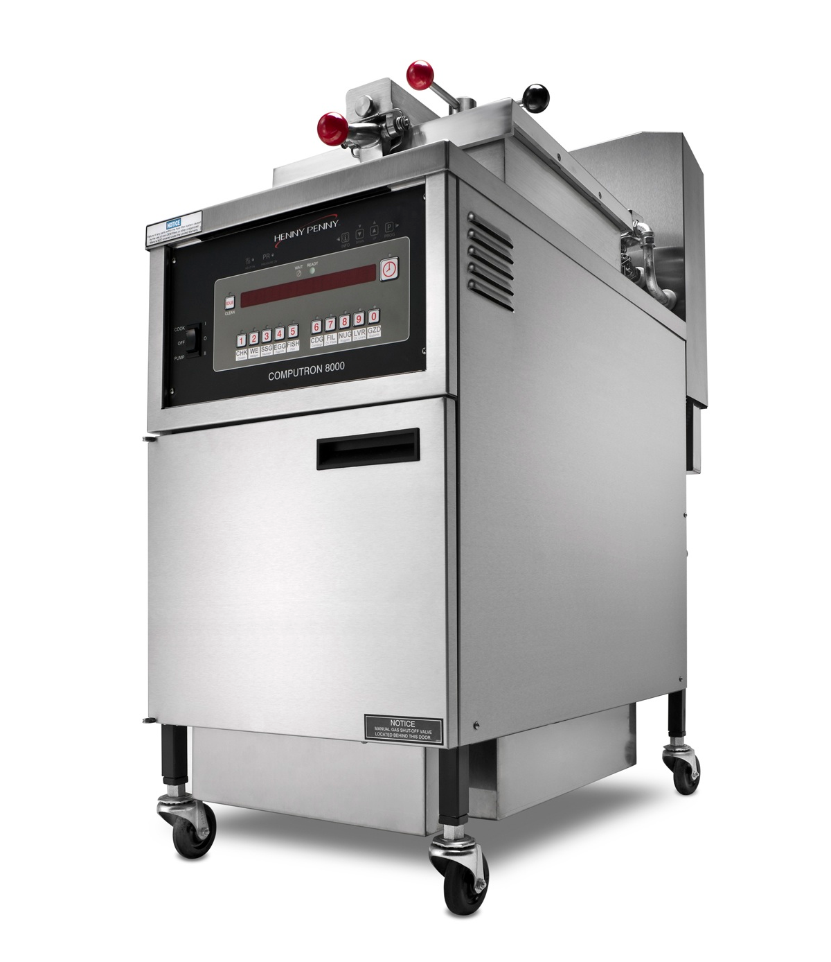
(Via Henny Penny’s Blog)
With growing competition and a constant struggle for market share, today’s foodservice operators face more pressures than ever before. You are surrounded by evolving — and sometimes conflicting — corporate initiatives and customer demands, requiring everything from menu expansion and decreased store footprints to more transparency, higher staff wages and much more.
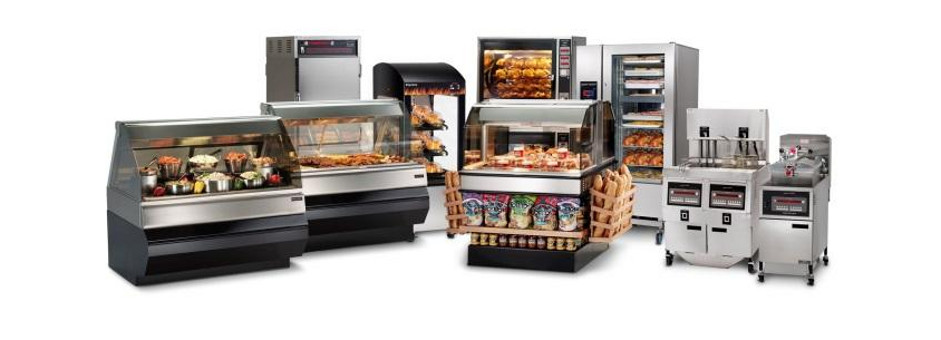
As you evaluate your list of desired upgrades and needed store repairs, it’s often easy to look at cooking equipment as just another expense. However, it’s important to realize that the equipment you choose for your kitchen does much more than simply cook food. The right equipment can make your facility’s system stronger as a whole — providing greater flexibility, maximizing smaller kitchen space, streamlining workflow and even building in cost and labor savings.
Two particular product categories worth considering are combi ovens and fryers:
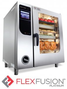 Combi Ovens
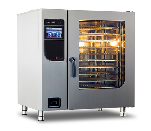
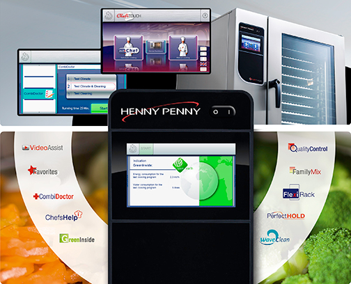
Popular in European kitchens, combi ovens aren’t as widely embraced in U.S. facilities — perhaps due to lack of awareness. But the benefits they provide are invaluable to high-volume operations and low-traffic businesses alike.
- Healthier foods: Consumers are demanding healthier options while still expecting the usual menu items. Finding the right balance may seem difficult, but combi ovens can help operators enhance any menu, as these ovens can roast and steam proteins and vegetables while also baking desserts and other hearty side dishes.
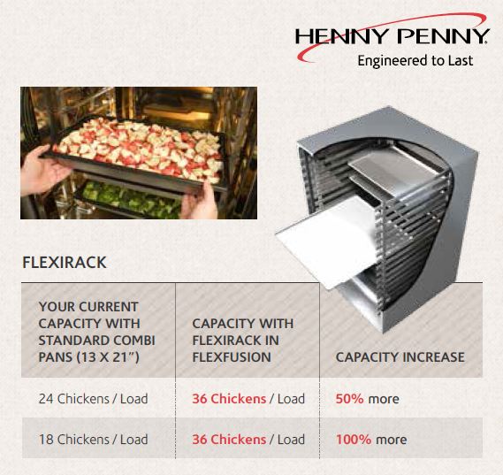
- Smaller footprints: Cooking with a combi oven eliminates the need for convection ovens and steamers, clearing valuable floor space. And for even the tightest kitchens, more compact options like the Henny Penny FlexFusion Space$aver combi oven can fulfill a variety of cooking needs.
- Flexibility: It’s hard to predict the menu trends of the future, so it’s important to have equipment that can accommodate a wide variety of foods and cooking methods. A combi oven can often handle a wide variety of current menu items, while also providing flexibility for the future.
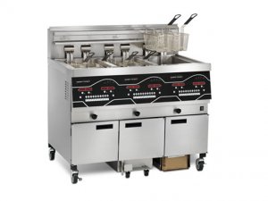 Fryers
From QSRs to fine dining and even non-commercial kitchens, fried foods are often a menu staple. However, fryers are often looked at as one in the same, despite the many differences in volume, specialty and innovative features.
- Flexibility/Space Savings: Some menu items are better suited to pressure frying—a method that locks in flavor and moisture—while others are meant for open frying. However, when space is at a premium, a pressure fryer can double as an open fryer to provide maximum flexibility.
- Volume: Some fryers are designed especially for high-volume kitchens and can help increase throughput while reducing oil costs. However, if you select a high-volume model that you don’t truly need, you might actually be wasting oil and energy.
- Cost-savings: With Henny Penny’s next-generation Evolution Elite open fryer, operators can realize the cost- and labor-saving potential of Smart Touch Filtration™, the latest advance in built-in, push-button filtration from Henny Penny. With a suite of oil-conserving features, the Evolution Elite allows for 40% less oil in the frying vat — savings that goes straight to the bottom line.
Equipment as an Investment
With careful purchasing choices and knowledgeable industry partners like Henny Penny on your side, it’s easy to make equipment a net positive for your operation. Keeping in mind how each piece functions as part of a larger system, you can create an efficient combination of equipment that maximizes space, saves time and labor, and builds a foundation for growth and expansion for years to come.

